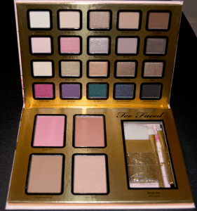
Remember this?
I hope so, I shared its unboxing last week. That was exciting and all, but more exciting (in my opinion) would be looking at this limited-edition mega-palette in a bit more detail.
Let’s just jump right into the Too Faced Everything Nice Palette Swatches and review!
Starting with the top row of shadows:
 Too Faced Everything Nice Swatches
From left to right both within the palette and on my arm, all swatched over Too Faced Shadow Insurance primer (which does not come with it):
- Turtle Dove – A matte white. A little chalky, but not impossible to work with. Relatively sheer, you may have to build this up or use it over a white base.
- Dream On – A light, warm-toned beige with a finish that lies somewhere between satin and matte. It is powdery, but pigmented; I’d definitely use a flat-shader brush with this to reduce it going all over.
- After Hours – One of several gold-ish shades in the palette, After-Hours is mid-tone golden brown. It is metallic/frosty and is a fantastic neutral that can be used both day and night. Nice and pigmented.
- Fawned of You – This palette’s glorious crease/transition shade. It is a warm, matte, mid-tone brown; lighter and a smidge cooler than both UD’s Buck and Lorac’s Taupe. Not super opaque pigmentation in one swipe, but for what many of us will primarily use this for, it doesn’t need to be. Blends out easily.
- Knockout – Another matte, this warm brown is buttery and blendable (the swatch unevenness was my own user error, not the product). Really great for the outer V or lower lashline.
Second row of Everything Nice Swatches:
- Paper Roses – Light, neutral, frosty pink. On me, it doesn’t look super pink unless you build it up or use a white base. Goes on smoothly. According to Temptalia, apparently Too Faced has another shade called Paper Roses that is completely different.
- Kindness is Free – Another frosty pink, this one is a bit deeper and yellow-toned. The texture feels a bit dry, so I usually apply it with a wet brush to get better color payoff. Sadly, it fades a bit by the end of a workday.
- Mauvelous – A super-frosty, sparkly mauve. Honestly, this one ends up looking more silvery (due to the shimmer/sparkle) than mauve. Still a pretty color, but like many sparkly shades, fallout is crazy – consider using a shadow shield or doing eyes first if you will be using this shadow.
- Be You – A matte, mauve-y purple. As you can see from the swatch, it doesn’t apply or blend easily, so you’ll need to take a little extra care applying this one. Be patient with it, and try patting it on instead of swiping. I got a little impatient when I first used it in a look and almost had to scrap the whole thing.
- Secret Lovers – is a dark brown with a great sheen – it isn’t shimmery, sparkly, or metallic, and is a bit more than satin. It blends out superbly (even with a finger!) and feels very buttery going on.
Row the Third – Everything Nice Swatches:
- Heaven – Of the two light, matte shades in this palette, this is my preferred. Warmer, more of an ivory than a white, this shade’s color payoff is a fair despite being powdery.
- Shiny Happy – Shiny Happy is a cool, sparkly, metallic gold; welcome among a sea of warm golds. Despite the sparkles, it doesn’t fall out much and is pigmented.
- Honey Pot – is a buttery, warm-toned metallic gold. Great pigmentation, it applies well.
- Don’t Settle – Initially reminded me of UD Smog, but is quite different. Cooler, this metallic olive-brown isn’t as buttery as the two prior in this row, but still applies easily.
- Girly – is a warm, metallic reddish-brown with a cyan duochrome that makes a recently popular look easier to obtain. Like the golds, it is nice and buttery.
- Even though it is a neat color, if you’re struggling with how to use it, here are a few looks you can achieve using this color: Batalash, LustreLux, Jaclyn Hill.
Fourth Row (the fun row) of Everything Nice Swatches:
The first four in this row were swatched over both TFSI and Nyx Milk (left side of each).
- Totally Fetch – is a unique color, but not the first time Too Faced has put it in a palette. This exceptionally vibrant, cool fuchsia has a satin-to-pearly sheen and almost has a blue-purple shift. Sometimes, colors like this disappoint when applied because they just aren’t pigmented enough, but this is NOT the case for this bold shade that, of course, you should be wearing on Wednesdays.
- Live it Up – applies pretty dry and sheer which is disappointing considering how fun this shade is. This pearlescent, sparkly, mid-purple is not opaque but can really be helped out with a white base as you see above in my swatch. It has one of the lowest wear-times in the palette even with primer/white base. The sparkles do fall out during application and wear.
- Too Glam – When I was first looking into this palette (before I checked other swatches), I thought this was a metallic green, but it is in fact a frosty, metallic teal. This super-pigmented shade is gorgeous even though it wasn’t what I was expecting.
- Head Over Heels – this cool, dark greyish-blue with blue glitter looks outstanding in the pan, and swatched onto a finger. But, when applied to a lid (or forearm, like in my swatch), it presents very sheer. Don’t expect to slap this on and get a vibrant, shimmery sapphire blue.
- Chocolate Moon – is a black-brown that doesn’t blend as well as I really hoped it would (dark shades should not be patchy, IMO). The shadow itself is matte but has golden glitter that falls out. Makes a decent shadow-as-liner, but I haven’t used it for much more than that in a regular look.
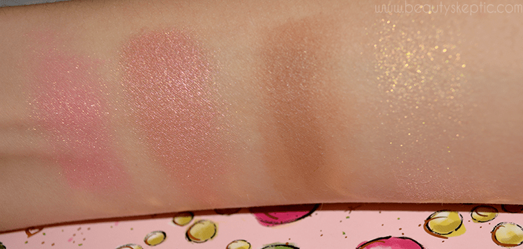
And finally, the face:
- Sweet Pink – A medium baby pink with golden shimmer. Too cool and shimmery for my personal tastes, but that doesn’t make it bad. It is smooth and blends well.
- Papa Don’t Peach – A medium peach blush with a warm sheen, this is more my speed. This buttery blush blends out superbly and looks good even on very pale skin.
- Chocolate Soleil – I have a deluxe sample of this. A nice matte bronzer that smells great and blends well, but not really appropriate for contouring for more people (too warm). It is powdery yet pigmented.
- Inner Light – looks peachy-beige in the pan but shows up as just gold shimmer on me. As a highlight, it is a little too obvious for my tastes; I recommend applying with an exceptionally light hand so you don’t look like you just slapped gold glitter on your cheekbones and called it a highlight. It is pretty, but I will probably be using this more as an eye shade than for its intended purpose.
Now that I’ve reviewed and shown you the Too Faced Everything Nice Swatches, it is clear that not everything is completely perfect. That said, the palette is still well worth the money – if you break it down per product pan (and say that the face products equal two eye products), each item winds up being about $2 each, plus you get the glittery clutch, the deluxe Too Faced Better Than Sex mascara, and the brushes. You can’t even get drugstore quads for that!
The balance of, “fun,” shades, dark/dramatic shades, and wearable shades is on point for me; I normally like to hang out in the safety of my comfort zone that is filled with neutrals, but this has just enough boldness to nudge me out of my comfort zone without being something I’m, “afraid,” to touch (nay – Totally Fetch is fantastic) but it has enough of a pretty neutral (all the golds!) safety net for me to retreat to when I feel like it.
If you’re wanting this palette, I stand by thinking it is worth it. This Sephora exclusive is unfortunately still sold out online but may be available in your local Sephora or Sephora in JCPenney – call your local store to see if they have it on hand (mine does)!


1 thought on “Too Faced Everything Nice Swatches”
Comments are closed.